
I saw a recent social media post where educators were complaining about the use of PowerPoint in the classroom. PowerPoint, Keynote, Prezi, or whatever presentation tool you prefer is usually not the problem. The problem is that computer software has made creating a presentation quite easy. Creating a great presentation is much more difficult. Developing an excellent presentation has far more to do with how the user implements the tool than the tool itself. Let’s take a look at five simple steps you can employ to improve your audiovisual aids, whether you’re teaching in a classroom or online.
- Don’t overdo bullet points or text on the screen
One of the biggest mistakes people make in visual aids is packing too much text on the screen (Figure 1). It is tempting to use the screen as an outline or data dump for your presentation by listing all the information that you want to get across. However, when you put all that text on the screen, people attempt to read the screen and not listen to you as thoroughly. When they are reading the text on the screen they might miss critical points you make in discussion. It is also tempting to let the presentation be simply a series of bullet point slides, which can often be dull and ineffective. How many times have you seen a presentation where the presenter simply read the text on the screen out loud? Was that presentation effective? Probably not.
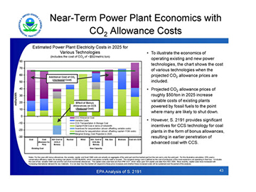
Figure 1
- Improve color contrasts so things are easy to see
One of the concepts that’s crucial for an excellent presentation is color contrast on the slides. Remember that you may display slides in brightly lit rooms, and if the projector bulb is not bright it may be challenging to see gradients and contrasts between different colors (Figure 2). When you use background colors that are close to the same color as fonts that you are using, the text can get lost on the screen, and people have to strain hard to read it. Once they are expending additional energy to read the text the meaning will get lost.
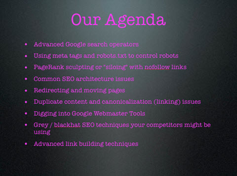
Figure 2
- Use a dynamic image to convey a concept
I spoke earlier about removing text from your slides. But when you do that, some presenters don’t know what to put on the screen. In a great presentation you’re also telling a story. A powerful image can convey important aspects of the story. People get the image, but they will be listening more intently to what you’re saying because they’re not distracted by trying to read words on the screen. Images have power and the content conveyed along with a powerful image will sink in more effectively. Figure 3 is an image from a presentation when I was trying to get across a concept of the guru nature of education in our profession and the extensive use of made-up names for different treatment techniques. The image conveys a lot more than the words alone.

Figure 3
- Ditch the fancy backdrops in your slides
Our computer presentation tools have made it easy to slip in visually diverse backgrounds behind the content on our slides. In the old days, these backgrounds were pretty rudimentary graphics. Now all kinds of images can be placed behind the slides. Don’t mistake an interesting image for something that is educationally beneficial. A distracting image makes it more difficult to grasp the content on the screen. See how the white waves make the background busy and the text harder to read in Figure 4. The image doesn’t enhance the content at all.
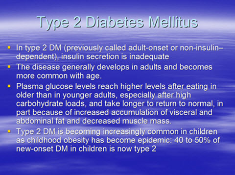
Figure 4
- Learn enough about image resolution so you can produce attractive images
Image resolution can convey a compelling picture or become a significant distractor. An image can look good on the screen when it is relatively small, but when blown up to a large size it can look fuzzy. Fuzzy images convey a poorly designed presentation. If you are reading this on a small screen, the image in Figure 5 may look OK. However, when you blow it up to the size for a slide presentation, it is very fuzzy. A standard slide-based presentation size is a 4:3 ratio or 10 x 7.5 inches. If you are going to use an image that is going to take up the whole screen, make sure it is no smaller than 10 x 7.5” at a resolution of 72 dpi (dots per inch). Ideally, when you use a large full-screen image like this you might want to go up to 10 x 7.5” at 96 dpi.

Figure 5
If you’re using smaller images on your screen make sure they correspond to a similar ratio of size versus the dpi resolution of the image. Most of the presentation tools now have some basic image editing capabilities to make adjustments to images. It is easy to make pictures smaller. The big problem comes when you try to make smaller images into larger ones on screen.
These are just a few key points that will help you enhance the quality of your visual presentations. It is challenging to maintain student attention in subjects that have complex or dry content. An excellent visual presentation can make that presentation engaging and much more interesting for students.
________________________
Do you offer CE courses in your school?
Now you can offer the Academy’s Online Orthopedic Massage Program at a reduced rate for your students and earn a commission at the same time.